
Rivian Internal native app
Factory End Of Line Tool (EOL)
At Rivian, I led the design of the factory application allowing technicians and leads to complete tasks needed at the final steps of production such as final checks and calibrations. Vehicle management after the production line was poor causing low factory output. The pressure was high - We were pre-IPO and customers had been waiting for ~3 years for their vehicle after pre-ordering. Additionally, valuable data reflecting production issues and patterns, were not being captured effectively. This delayed the learning and adapting in real time of factory processes and pattern failures.
The Problem
Excessive time to complete Factory End of Line Tasks
Lack of information for uncompleted processes
Unreliable tracking of vehicle status and location in factory
No centralized data capture for issues or patterns identified
My Role and Responsibilities:
Lead Designer for internal native mobile application
Design advisor for the desktop counterpart
Researcher for in-factory processes and flows
Platform
iPad Pro - iOS

The Team:
1 Product Manager
1 Engineering Manager
3 Front End Devs
1 Back End Engineer
1 Lead Designer (Me)
My Approach
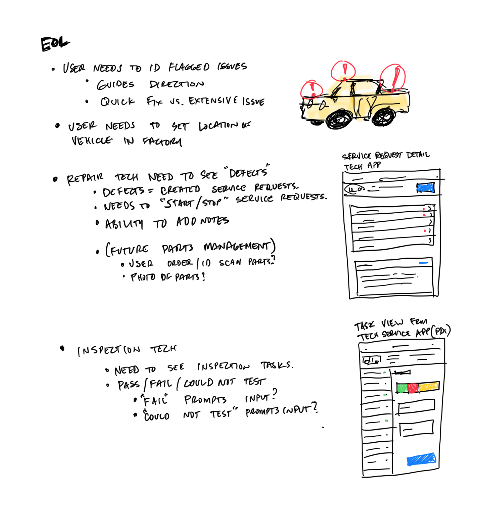
I coordinated with the team, users and other stakeholders to gather initial requirements to help provide guidance for an MVP. We worked with 8 Factory Technicians (4 Repair, 3 Inspection, 1 Shift Manager). We also worked the Director of Operations and the CEO.
Factory Visits
Gather Requirements

Assess Current Systems
Exploration and Proof of Concept
Factory Visits Learnings
I visited the factory to try to understand some basics:
Users and their responsibilities
Factory Requirements
Factory Layout and Processes
Pain Points and Opportunities
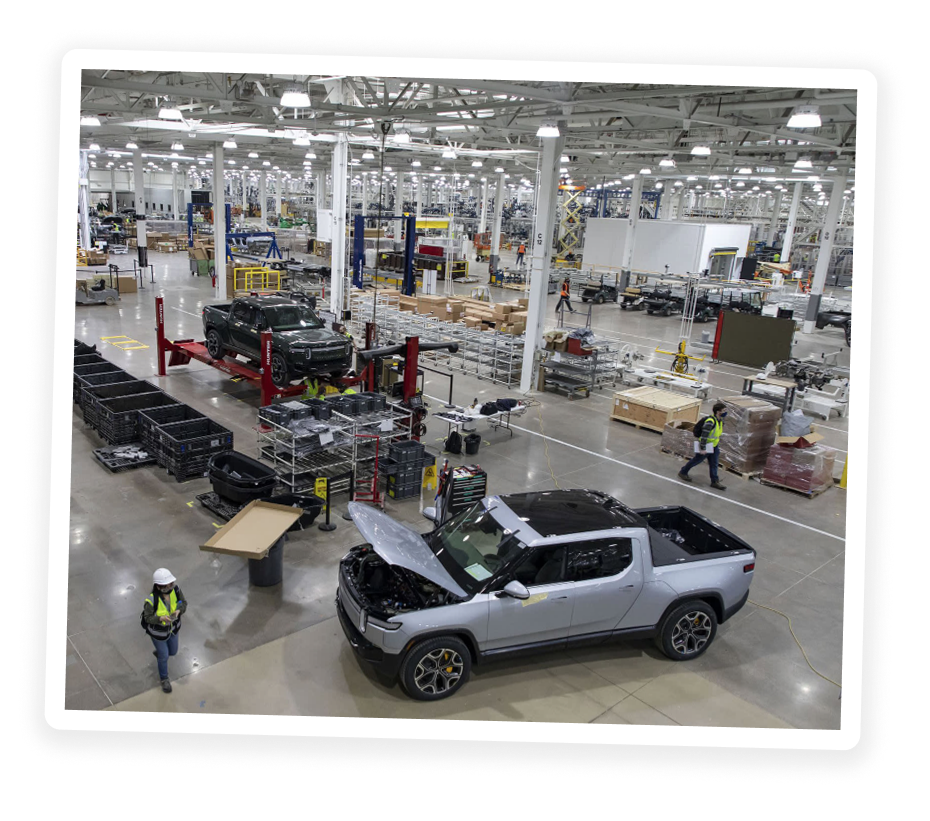
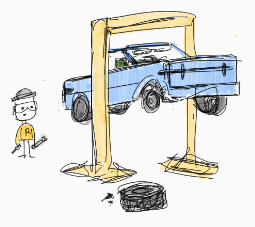
Factory layout (End of Line)
Work Order Status structure we had to work with
Initial Decisions We Made
The physical location and setting of the factory would dictate a lot of the UI decisions.
Status UI must be easily read from 2 meters distance
Adhere to AA - AAA WCAG 2.0 in color and type
Establish hierarchy of primary CTAs on screen
User needs to know where they are in the app at all times
Assessing Current Systems
I learned what was being used in the industry and in our factory. One of the goals of this project was to align to the existing mobile application design. This meant identifying what worked well and what was “noise” in legacy systems. We found users experienced unnecessary friction when trying to navigate their workflows. Many times, there was no clear path to take in the UI.
Exploration
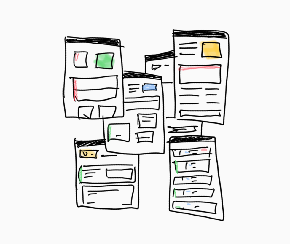
Considering the application would be used on an iPad Pro, I started sketching and exploring UI options for the main use cases and screens we planned to launch in the application. I started with some of the more challenging status display screens.
Proof of Concept
After initial sketches and mocks, I created prototypes to communicate the key flows we were defining for MVP. Being able to “tap” through flows helped identify gaps and edge cases. It was critical step for stakeholder buy-in and defining a MVP.
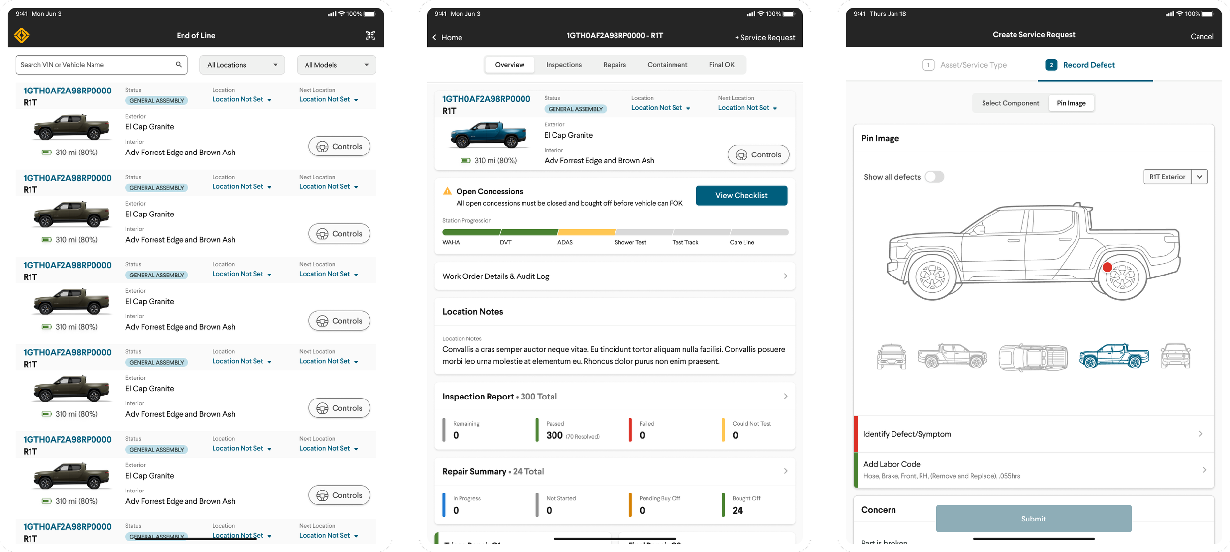
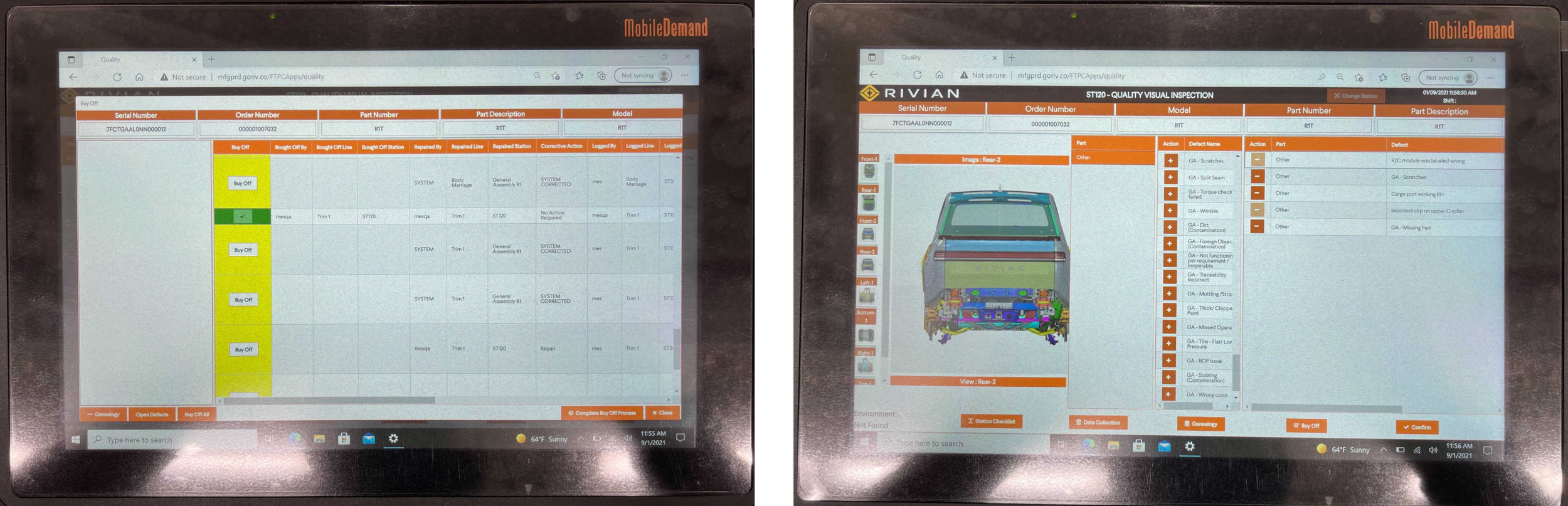
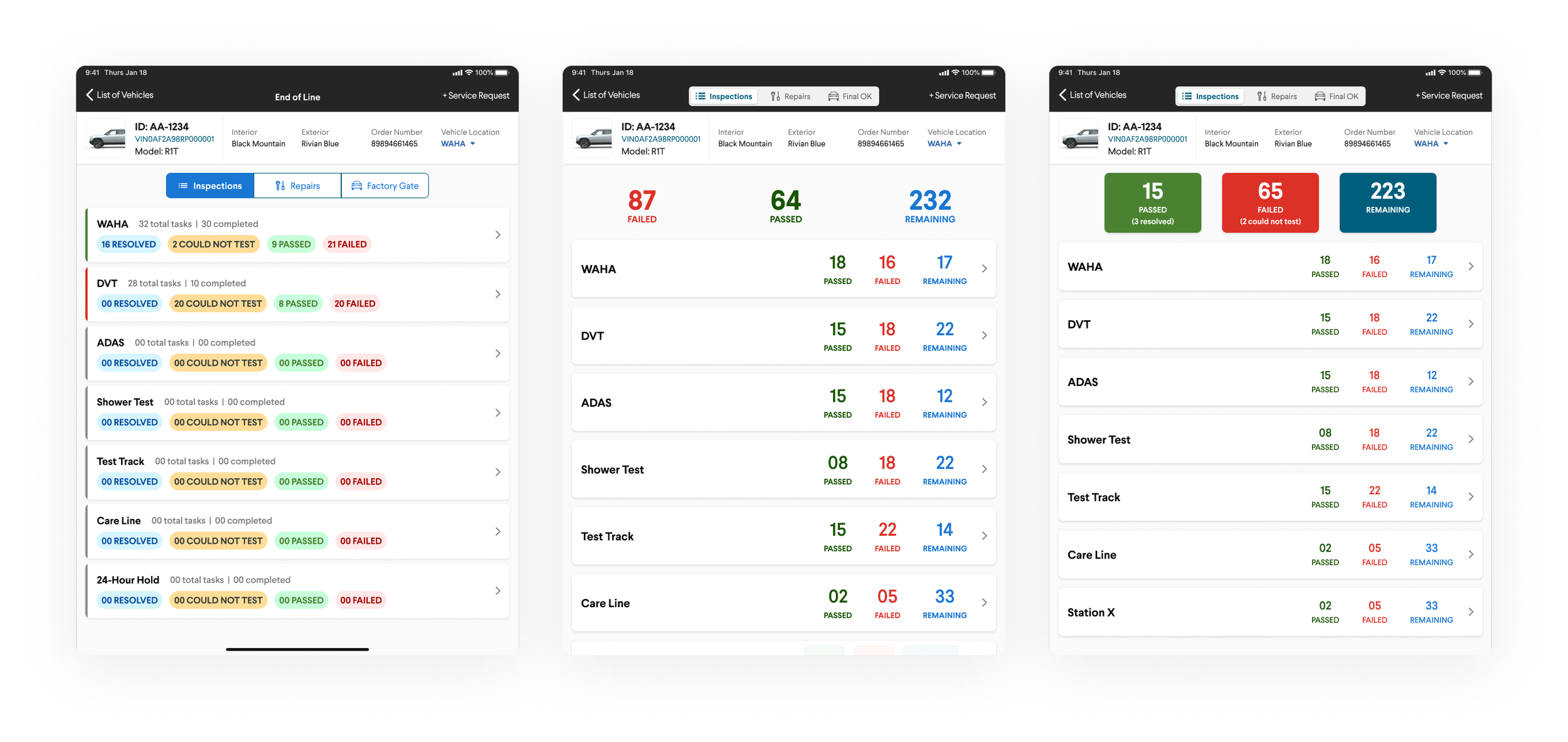
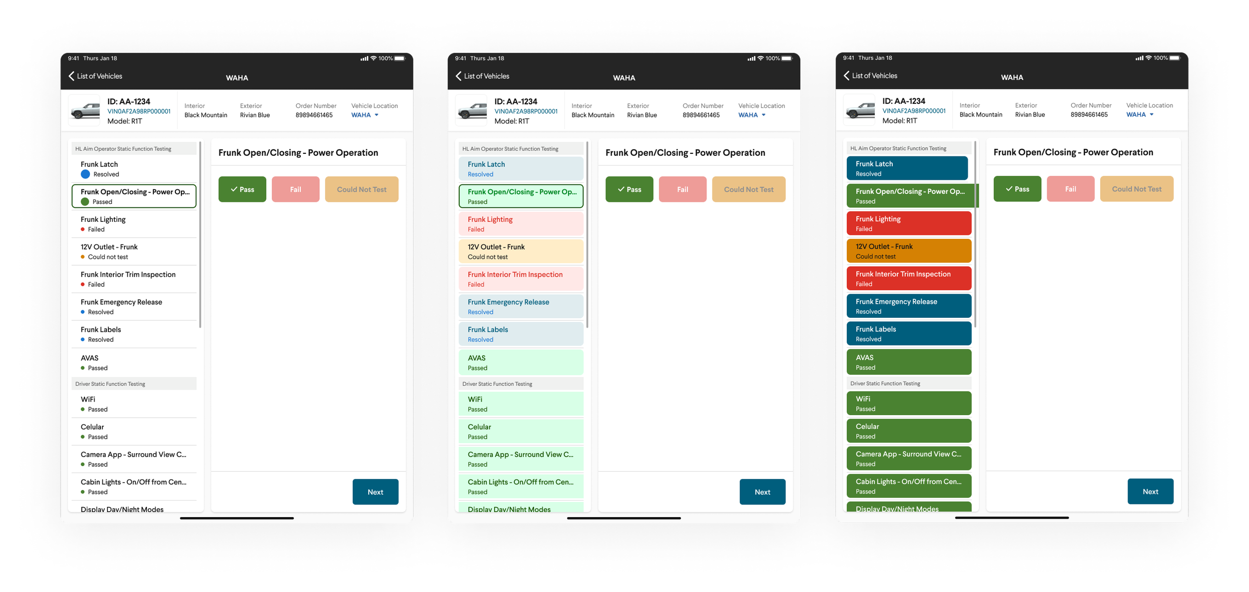
A list of vehicles - Work Order auto-generated in production
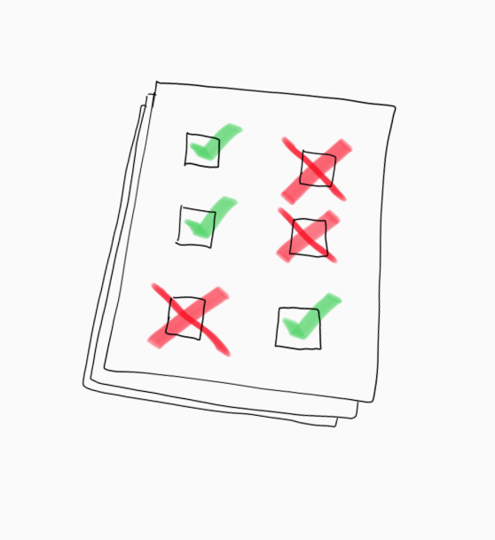
Display inspection and repair station status
Allow user to input task outcome and notes
Vehicle location management
Scan VIN Data matrix code

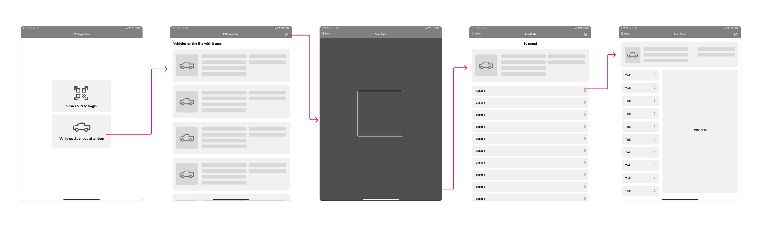
Initial wireframes for engineering discussions
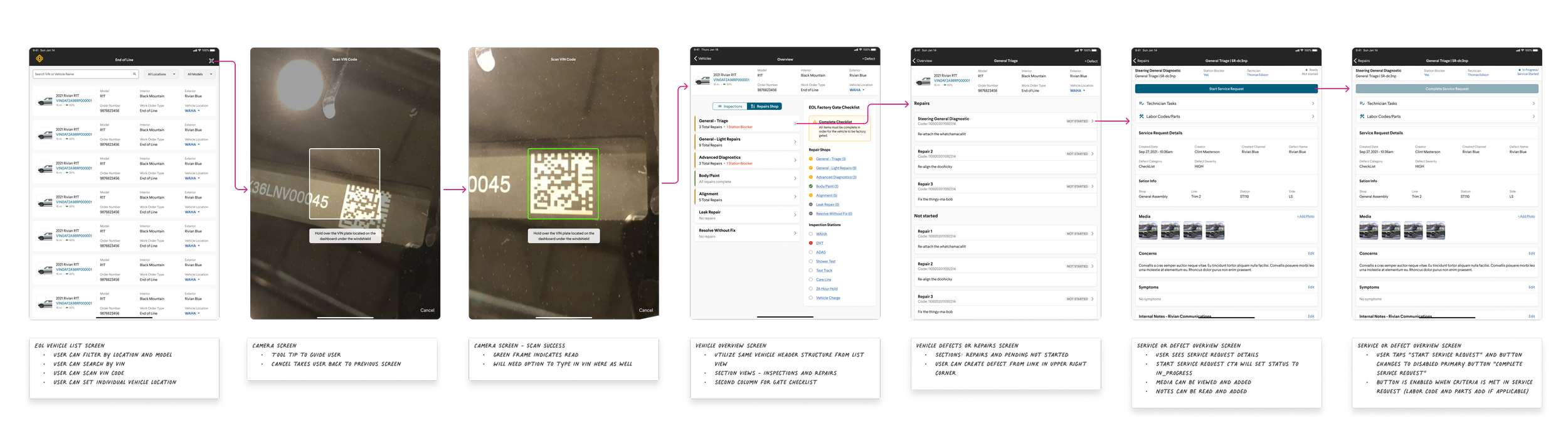
Proof of concept prototype
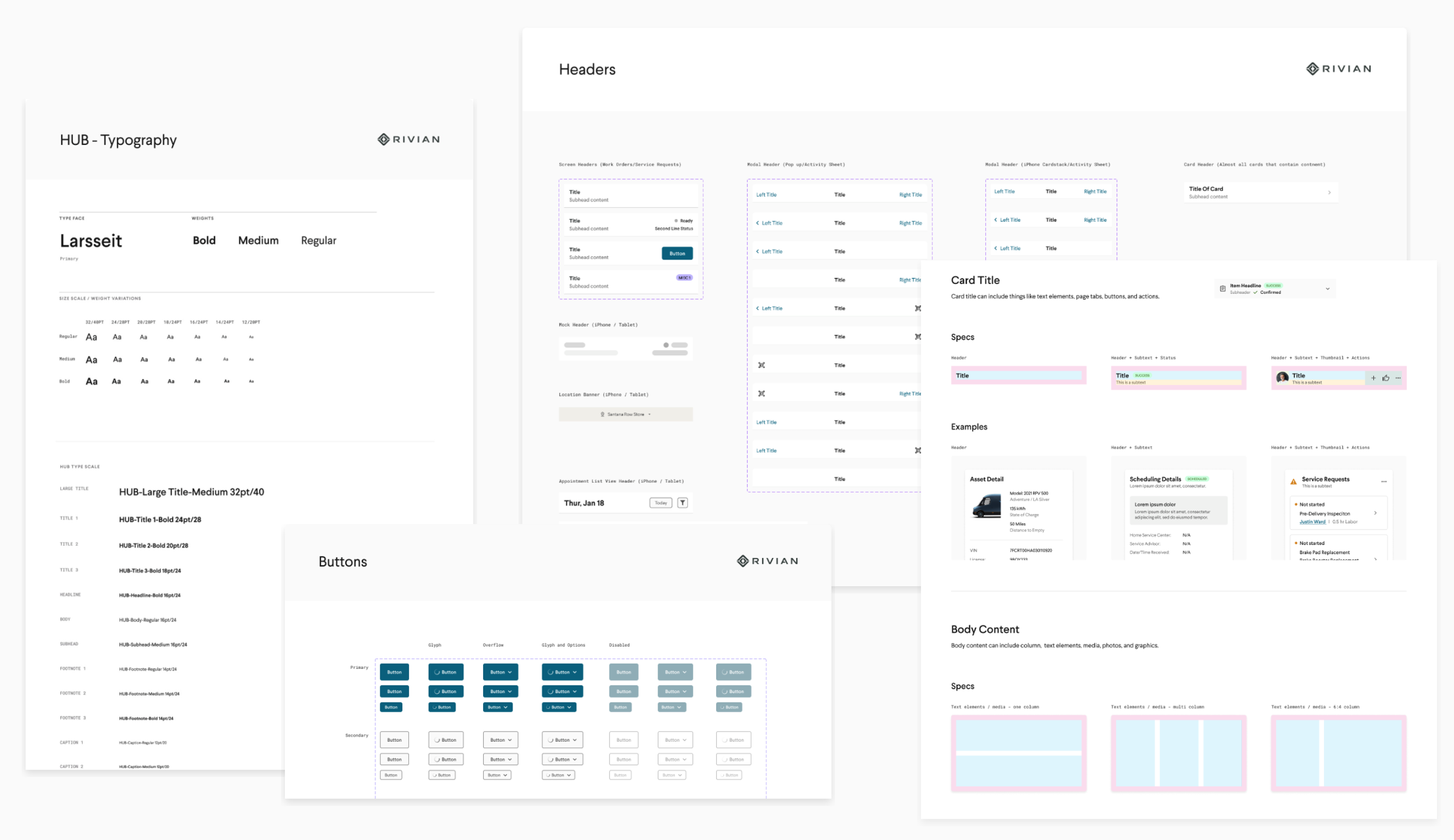
Leveraged Design System and Component Library
In a previous project, I created the mobile component library based on the Rivian Design System (RivanOS). I worked with the engineers to structure the components, ensuring we remained aligned.

Engineer Hand Off
Being that the communication with engineering and product was intimate on this project, there were no surprises during hand off.
Shared component library with defined patterns
Dedicated Page in master file for each design associated with JIRA ticket.
Clickable prototypes
All image assets formatted
Example of a hand-off page in Figma
Launch and Measure
We monitored some key metrics for the launch of the application.
Number of completed inspection tasks
Number of corrected defects
Frequency of signed-off vehicles
Quality of data captured
Basic user behavior

Results at the End of Week One
We closely monitored usage and found promising metrics!
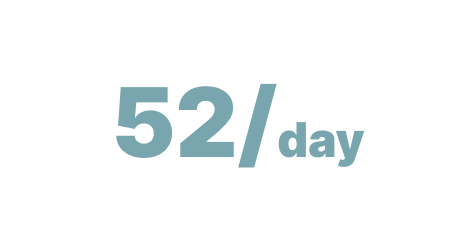
Tasks Completed
Increasing exponentially
Corrected Defects
Expected to increase, then decrease as production improves
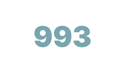
Factory OK Frequency
Increasing by a factor of 4 at the end of 3 weeks
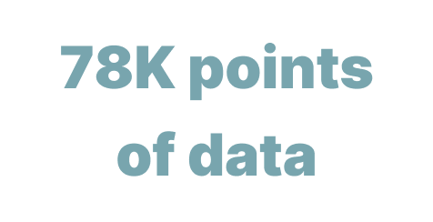
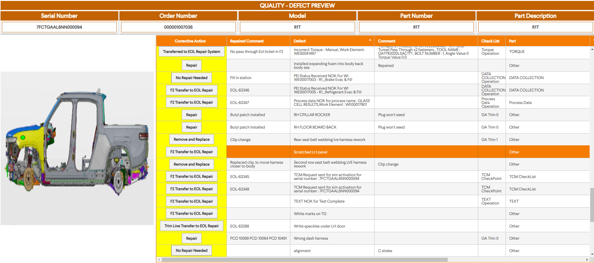
Quality of Data Collection
Some of which was used to power diagnostic efforts at service centers
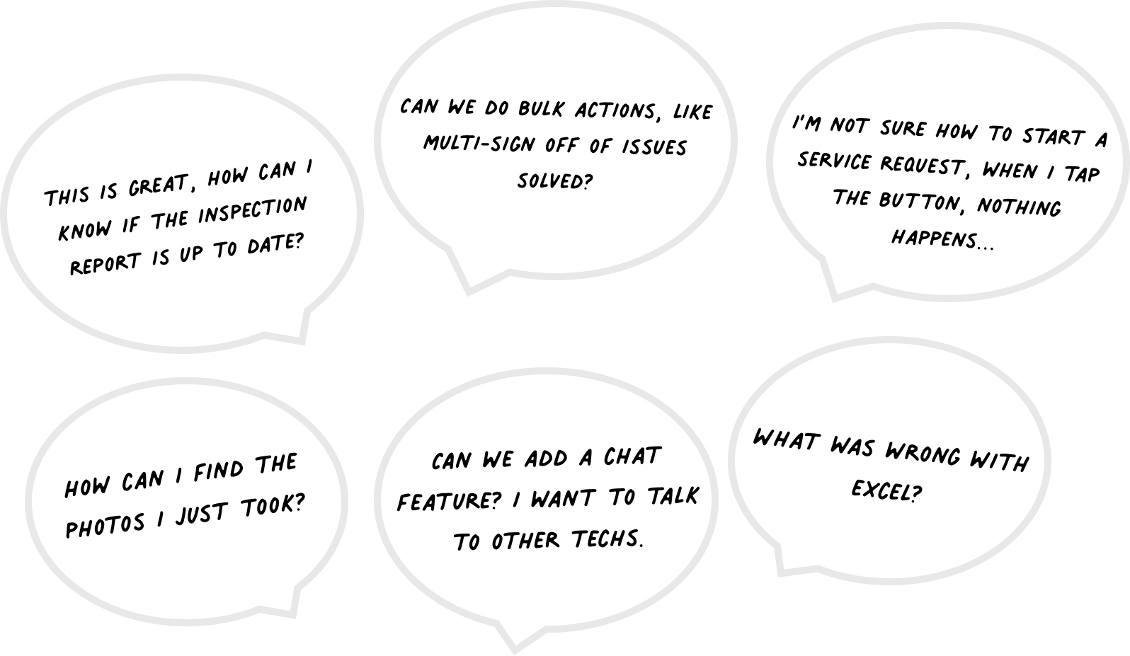
There Was Feedback
We gathered feedback and adjusted the strategy where needed.
We Began to Implement Updates
After assessing feedback and usage metrics, I updated some of the designs and began to roll them out.
Introduced a jump off screen to help guide technicians to their specific workflow faster.
Updated vehicle list screen with new information hierarchy and the addition of vehicle control access
Updated vehicle detail screen with clear at-a-glance status information and an intuitive navigation structure

Updated designs for key screens after feedback and metrics analysis
New Features Designed and Launched
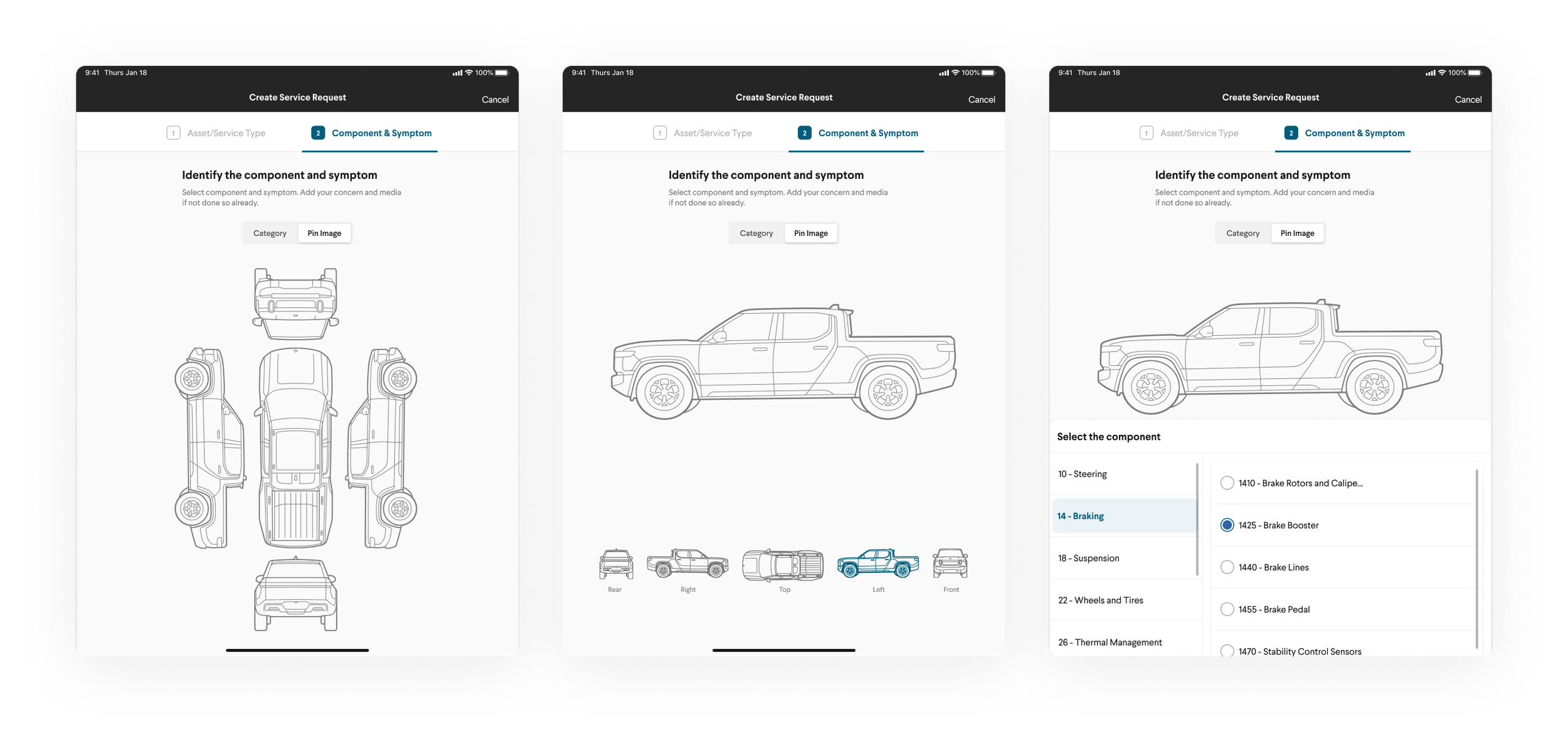
We began to introduce new features such as a defect capturing system that I designed. This system replaced a highly un-trackable whiteboard system they were using in the factory. The UI allowed users to “add a pin” to the area of defect, provide context for the defect identified, then create a subsequent Work Order to add the issue to a queue of work. We ended up making this feature accessible in almost all parts of the application.
Outcome
Overall, the application had a huge impact on the company - the timing was especially significant. We were pre-IPO and customers were starting to lose faith in their pre-order status. This application helped greatly increase the speed and quality of production of the first vehicles produced at the factory.